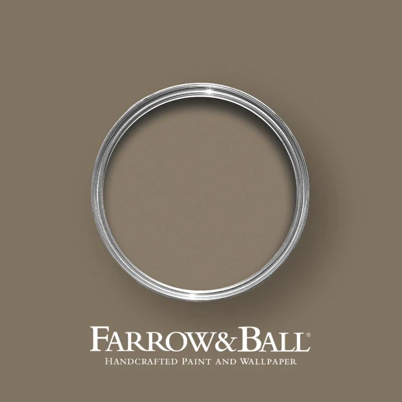
Farrow & Ball - Broccoli Brown No.198
Rich & comforting brown-toned neutral. Once a cherished Farrow & Ball Archive colour, Broccoli Brown is making a well-deserved return—bringing its deep, grounding warmth back into modern and traditional interiors alike.
More than just a neutral, this rich brown has a subtle red undertone, ensuring it retains its depth in all lighting conditions, never fading into grey. A natural companion to wood, stone, and earthy materials, Broccoli Brown is quietly sophisticated, perfect for creating calm, understated spaces with timeless appeal.
Where to Use It?
Broccoli Brown’s deep yet muted quality makes it a versatile choice for a variety of interiors and exteriors:
- Living rooms & studies – A warm, enveloping shade that encourages comfort and contemplation.
- Bedrooms – Creates a cosy and restful retreat, particularly when taken across walls and woodwork.
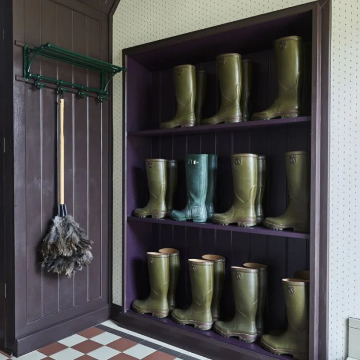
- Hallways & panelling – Works beautifully in classic interiors, adding a refined, heritage feel when paired with complementary tones.
- Kitchen cabinetry & furniture – Its earthy richness makes it perfect for adding depth to joinery and accent pieces.
- Exterior surfaces – A stunning choice for doors, shutters, or garden furniture, sitting harmoniously against natural materials like brick and stone.
Which Room Orientation Does Broccoli Brown Suit Best?
With its warm, red-based brown undertones, Broccoli Brown is beautifully stable across all lighting conditions:
- North-facing rooms – Remains rich and warm, never turning too grey, creating an inviting and grounding atmosphere.
- South-facing rooms – Sunlight enhances its depth, making it feel even warmer and more enveloping.
- East-facing rooms – The cooler morning light balances its warm undertones, while the evening light enhances its richness.
- West-facing rooms – Glows beautifully in the afternoon light, making it an excellent choice for rooms used later in the day.
How to Pair It
Broccoli Brown’s earthy sophistication pairs effortlessly with both soft neutrals and deeper, contrasting tones:
- For a refined, classic scheme – Pair with Farrow & Ball Stirabout for a muted, elegant contrast.
- For a timeless, nature-inspired look – Combine with Farrow & Ball Card Room Green or Scallop for a harmonious, heritage feel.
- For a bold, moody contrast – Use with Farrow & Ball Studio Green on trim to create depth and drama.
- For a more dynamic, modern twist – Pair with Farrow & Ball Beverly for an unexpected, uplifting combination.
Because Broccoli Brown interacts beautifully with different lighting conditions, we always recommend testing first.
Rich & comforting brown-toned neutral. Once a cherished Farrow & Ball Archive colour, Broccoli Brown is making a well-deserved return—bringing its deep, grounding warmth back into modern and traditional interiors alike.
More than just a neutral, this rich brown has a subtle red undertone, ensuring it retains its depth in all lighting conditions, never fading into grey. A natural companion to wood, stone, and earthy materials, Broccoli Brown is quietly sophisticated, perfect for creating calm, understated spaces with timeless appeal.
Where to Use It?
Broccoli Brown’s deep yet muted quality makes it a versatile choice for a variety of interiors and exteriors:
- Living rooms & studies – A warm, enveloping shade that encourages comfort and contemplation.
- Bedrooms – Creates a cosy and restful retreat, particularly when taken across walls and woodwork.
- Hallways & panelling – Works beautifully in classic interiors, adding a refined, heritage feel when paired with complementary tones.
- Kitchen cabinetry & furniture – Its earthy richness makes it perfect for adding depth to joinery and accent pieces.
- Exterior surfaces – A stunning choice for doors, shutters, or garden furniture, sitting harmoniously against natural materials like brick and stone.
Which Room Orientation Does Broccoli Brown Suit Best?
With its warm, red-based brown undertones, Broccoli Brown is beautifully stable across all lighting conditions:
- North-facing rooms – Remains rich and warm, never turning too grey, creating an inviting and grounding atmosphere.
- South-facing rooms – Sunlight enhances its depth, making it feel even warmer and more enveloping.
- East-facing rooms – The cooler morning light balances its warm undertones, while the evening light enhances its richness.
- West-facing rooms – Glows beautifully in the afternoon light, making it an excellent choice for rooms used later in the day.
How to Pair It
Broccoli Brown’s earthy sophistication pairs effortlessly with both soft neutrals and deeper, contrasting tones:
- For a refined, classic scheme – Pair with Farrow & Ball Stirabout for a muted, elegant contrast.
- For a timeless, nature-inspired look – Combine with Farrow & Ball Card Room Green or Scallop for a harmonious, heritage feel.
- For a bold, moody contrast – Use with Farrow & Ball Studio Green on trim to create depth and drama.
- For a more dynamic, modern twist – Pair with Farrow & Ball Beverly for an unexpected, uplifting combination.
Because Broccoli Brown interacts beautifully with different lighting conditions, we always recommend testing first.
Original: $7.69
-70%$7.69
$2.31Description
Rich & comforting brown-toned neutral. Once a cherished Farrow & Ball Archive colour, Broccoli Brown is making a well-deserved return—bringing its deep, grounding warmth back into modern and traditional interiors alike.
More than just a neutral, this rich brown has a subtle red undertone, ensuring it retains its depth in all lighting conditions, never fading into grey. A natural companion to wood, stone, and earthy materials, Broccoli Brown is quietly sophisticated, perfect for creating calm, understated spaces with timeless appeal.
Where to Use It?
Broccoli Brown’s deep yet muted quality makes it a versatile choice for a variety of interiors and exteriors:
- Living rooms & studies – A warm, enveloping shade that encourages comfort and contemplation.
- Bedrooms – Creates a cosy and restful retreat, particularly when taken across walls and woodwork.
- Hallways & panelling – Works beautifully in classic interiors, adding a refined, heritage feel when paired with complementary tones.
- Kitchen cabinetry & furniture – Its earthy richness makes it perfect for adding depth to joinery and accent pieces.
- Exterior surfaces – A stunning choice for doors, shutters, or garden furniture, sitting harmoniously against natural materials like brick and stone.
Which Room Orientation Does Broccoli Brown Suit Best?
With its warm, red-based brown undertones, Broccoli Brown is beautifully stable across all lighting conditions:
- North-facing rooms – Remains rich and warm, never turning too grey, creating an inviting and grounding atmosphere.
- South-facing rooms – Sunlight enhances its depth, making it feel even warmer and more enveloping.
- East-facing rooms – The cooler morning light balances its warm undertones, while the evening light enhances its richness.
- West-facing rooms – Glows beautifully in the afternoon light, making it an excellent choice for rooms used later in the day.
How to Pair It
Broccoli Brown’s earthy sophistication pairs effortlessly with both soft neutrals and deeper, contrasting tones:
- For a refined, classic scheme – Pair with Farrow & Ball Stirabout for a muted, elegant contrast.
- For a timeless, nature-inspired look – Combine with Farrow & Ball Card Room Green or Scallop for a harmonious, heritage feel.
- For a bold, moody contrast – Use with Farrow & Ball Studio Green on trim to create depth and drama.
- For a more dynamic, modern twist – Pair with Farrow & Ball Beverly for an unexpected, uplifting combination.
Because Broccoli Brown interacts beautifully with different lighting conditions, we always recommend testing first.